Polynomial Appraisal Regression
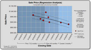
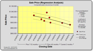
Dynamo MC now features polynomial appraisal regression (in addition to linear regression). We’ve received a lot of requests for this feature, so we hope you’ll find it useful in your appraisal analysis.
Why would this matter? In many markets, the seasonality of the market is a real factor. You may have noticed that buyers don’t like shopping for homes in the winter months, or even that sales slow to a crawl during the holidays. Polynomial regression allows a curved line to be used to explain a market trend, so fluctuations can be explained. This may allow you to better explain the behavior in your market.
We’ve overhauled our regression component to allow the appraiser to select the appropriate trend line to use for each chart or report. You may now select from these options for regression:
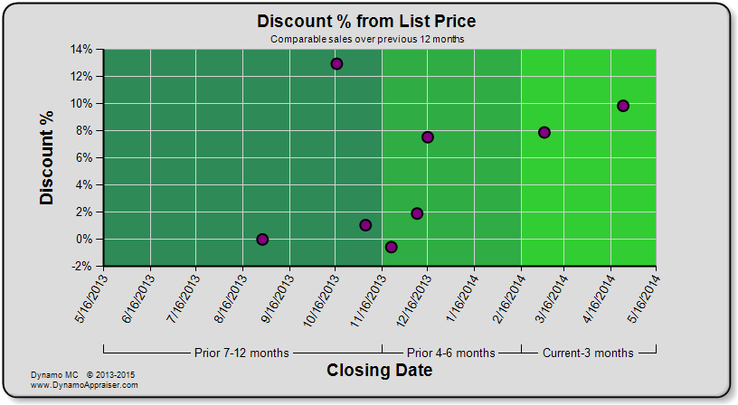
- None – No regression analysis will be performed
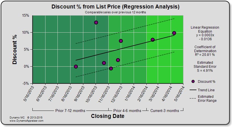
- 1st Order (Linear) – Applies a straight trend line.
- 2nd Order (Quadratic) – Applies a trend line with a single curve.
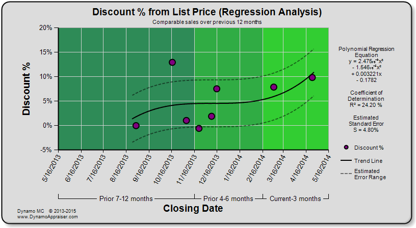
- 3rd Order (Cubic) – Applies a trend line with two curves.
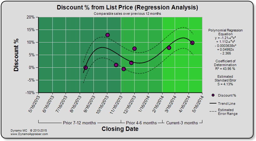
- 4th Order (Quartic) – Applies a trend line with three curves.
- Automatic – Dynamo MC will perform a mathematical analysis to automatically select the trend that gives the least amount error. This analysis gives more weight to lower order trend lines to explain the data.
You will be able to see a preview for these trend lines before you include them in your report on the chart and report steps in Dynamo MC. By default, linear regression will be selected for these charts and reports so that they continue to work the way the have previously.
Here is an example of different trend lines applied to the “Discount % from List Price” chart:
You should always review the charts and reports that are generated when using polynomial regression to make sure that the applied trend makes sense within your market.
Easy to see chart and report previews
Have you ever had a hard time seeing the smaller parts of the chart and report previews in Dynamo MC? We’ve implemented a full-screen preview so that you can easily zoom in for a closer view.
New color palettes available
We’ve added two new color palettes (Spreadsheet and Traditional) based on requests from our users. These are similar to the “Dynamo” color palette, but feature blue and yellow backgrounds.
There are other stability and usability improvements in the latest version of Dynamo MC (version 1.1.0.0) as well. For more information on what has changed, please check the Change Log. When you start your current version of Dynamo MC, you will be notified of the update and shown a link to the newest installer.
Does this update let you get more out of Dynamo MC? Please let us know at feedback@dynamoappraiser.com.


